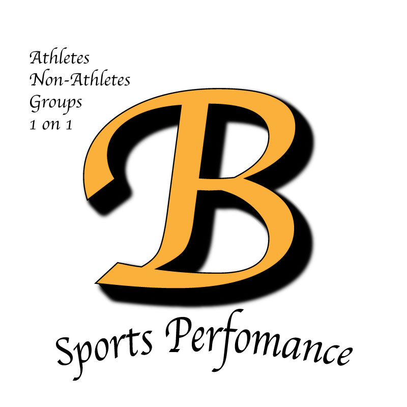
The design process to my logo was to incorporate the first initial of my last name with the text “sports performance” outlining or over it. In the initial draft logo project, I was looking to use more of the adobe illustrator tools and shapes to create my logo but found it more difficult to come up with a 3D letter to symbolize “Barefield Sports Performance”. With the critiques and help from my peers, I decided to use the text tool and insert the letter “B” and make it into a 3D letter itself with a shadow drop and different text font. The revisions to my final logo post consisted of having the “Sports Performance” text at the bottom of the letter so that it did not seem to be congested with the main focus of what the logo is. Some things that I also incorporated into the logo was a brief description on the left-hand side of what my logo’s purpose is and what the business is meant for. My original idea to the logo to make it known the purpose is for sports performance was to have the background of the main logo be something like a football to make it look as if the logo was printed on the side of a football. Another alternative to the logo was to include some kind of imagery of workout equipment like a barbell. The final decision and touches that I made with my final logo project were creating a unique 3D letter and have the description at the bottom of the letter to make it more readable. I was inspired to add more detail to the design so having the word descriptions included next to the logo helps give a better understanding to those looking at the logo and answering any questions they had about what “Barefield Sports Performance” is.
